Data Visualization | Information Design
Net Zero Carbon - Are we on track?
Creating a persuasive data informed campaign spreading awareness on the status of net zero carbon emissions globally.
Overview
Affiliation: Northeastern University
Role: Information Designer
Methods and Tools: Adobe Illustrator, Adobe Photoshop, MS Excel
Duration: 4 weeks
Background
This project was done as a part of the Information Visualization Studio at Northeastern University. The goal was to create data informed campaign on a globally relevant topic and using 4 mediums including including a print/large-scale series (billboard), a wearable (bag), a digital touchpoint (gif), and a print medium (newspaper cover).
Visualizations tell stories: they reveal connections and patterns that are otherwise invisible through data alone. This campaign is inspired by the aesthetics of Yayoi Kusama and informs the audience about the status and need for the world to have net zero carbon emissions by 2050.
Context
Net Zero Carbon - What is it?
Net zero means cutting greenhouse gas emissions to as close to zero as possible. These emissions are a result of human activities like use of fossil fuels or agriculture. To avert the worst impacts of climate change and preserve a livable planet, global temperature increase needs to be limited to 1.5°C above pre-industrial levels. Currently, the Earth is already about 1.1°C warmer than it was in the late 1800s, and emissions continue to rise. To keep global warming to no more than 1.5°C, emissions need to be reduced by 45% by 2030 and reach net zero by 2050.
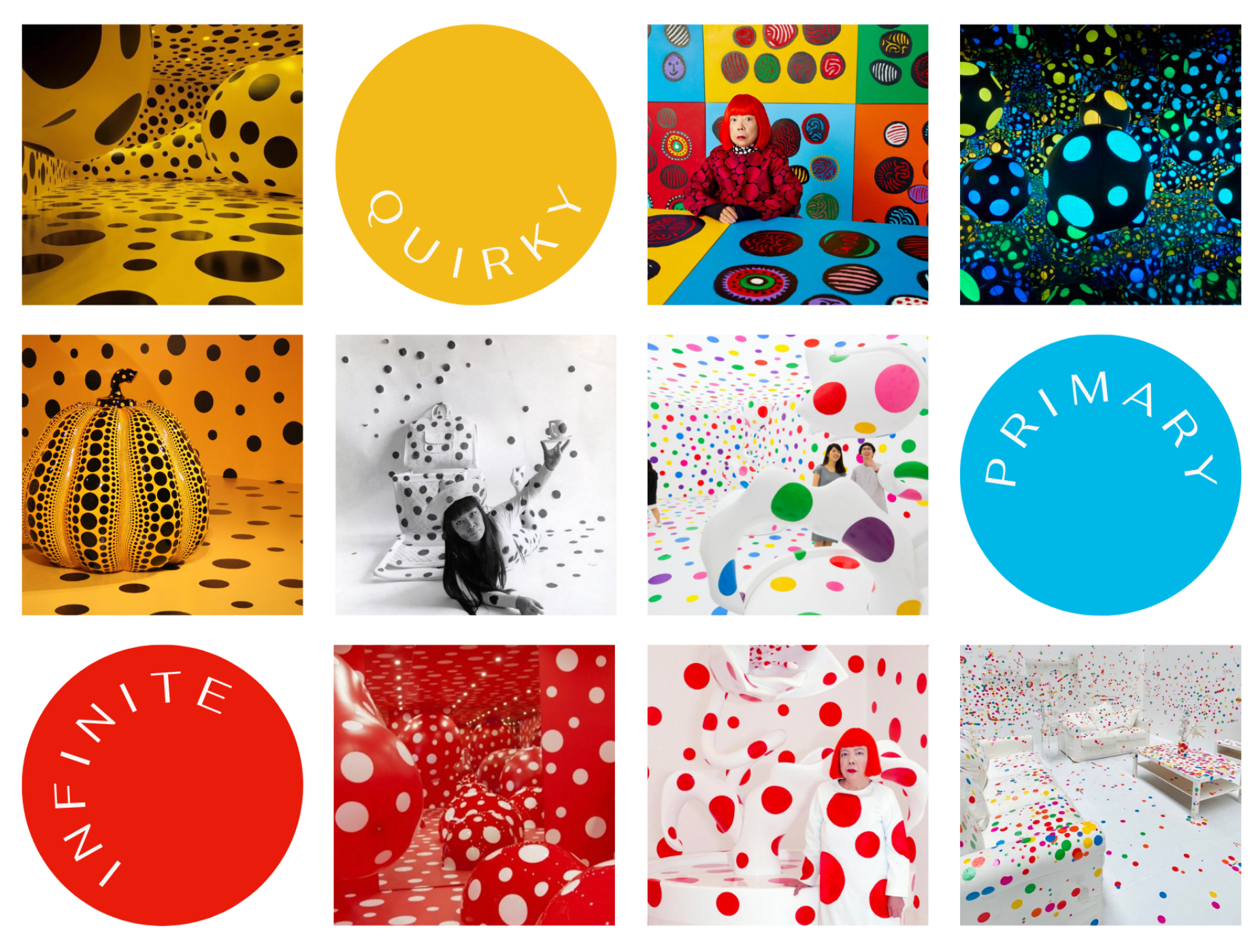
Artist inspiration
Yayoi Kusama
The visual theme of this campaign is inspired by the Japanese artist’s psychedelic art form that stems from a humble — POLKA DOT; and the use of primary colors
Process
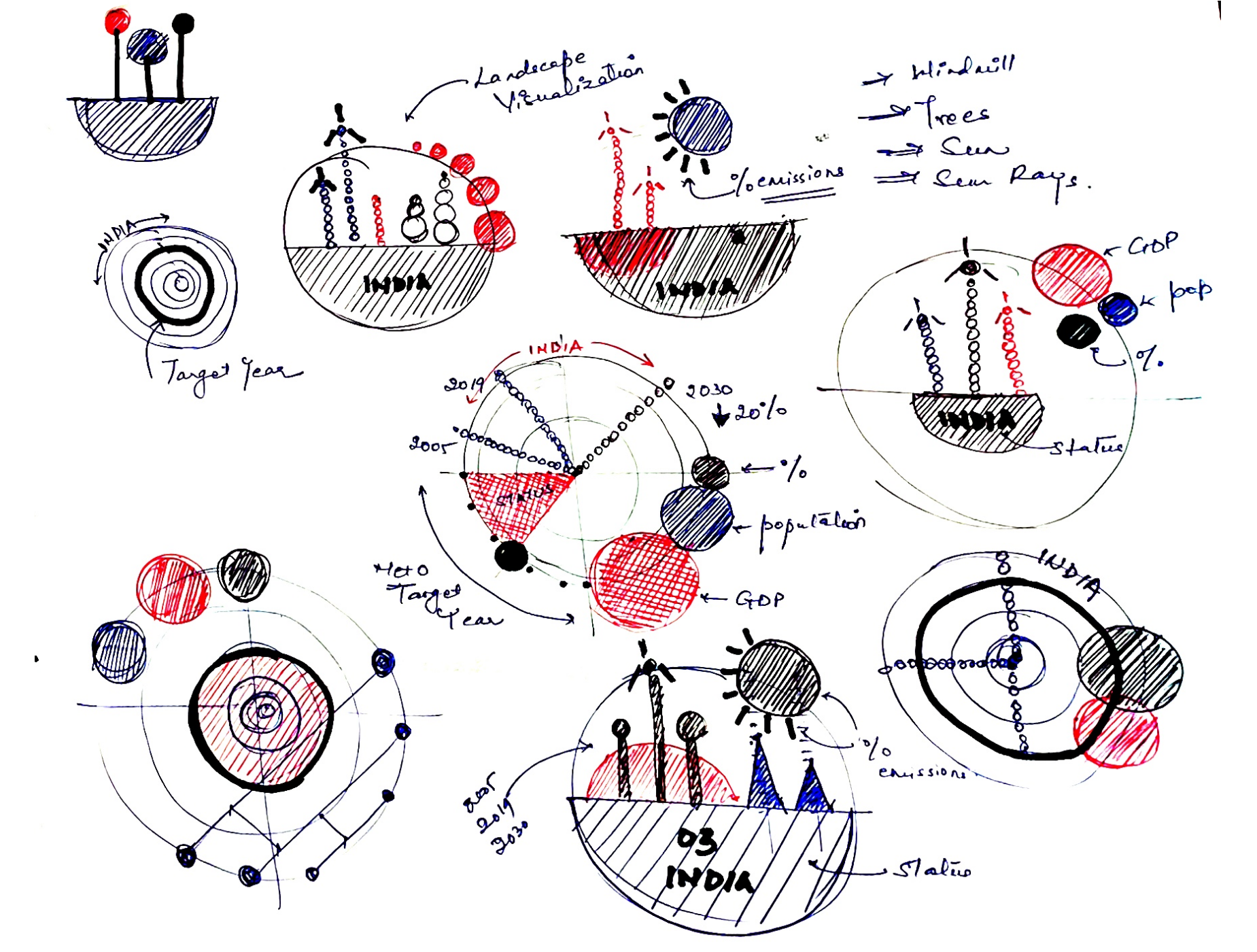
Sketching iterations
To begin with, I sketched iterations of data glyphs imbibing the polka dot from Yayoi Kusama’s aesthetic as the prime form of the visualization.
I follow Georgia Lupi’s works and admire her unique approach of synthesizing data and storytelling. I took this approach to craft a visual experience narrating global net zero carbon status, with landscape-inspired visual index concepts.
Data set
Here is the data set I used
I used data from multiple datasets and compiled them together. Achieving net zero carbon depends on multiple compounding factors besides just the green house gas emissions. These include population density, country size and GDP to name a few. In order to get a more holistic view of the situation, I incorporated these data points to create the base data set.

Final Design
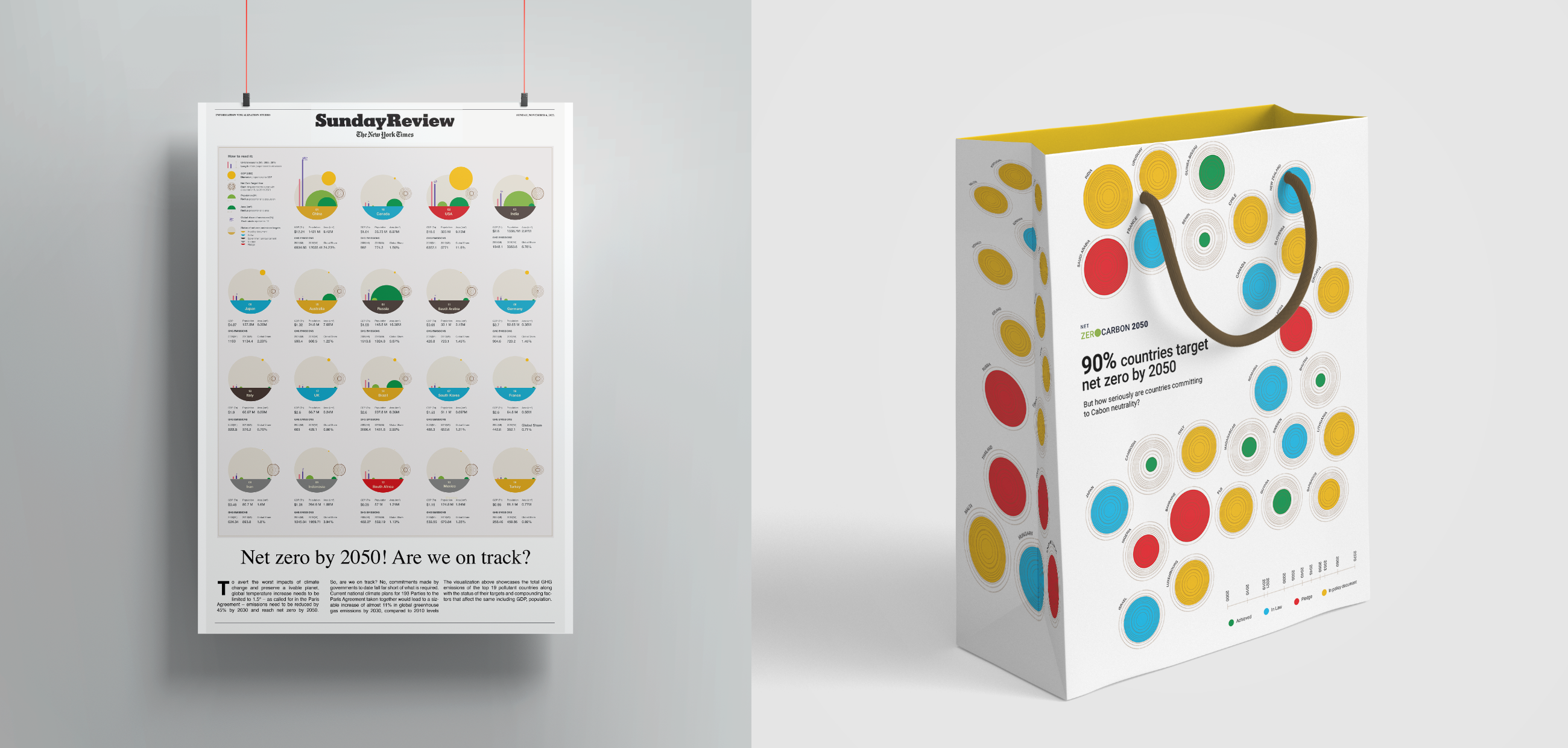
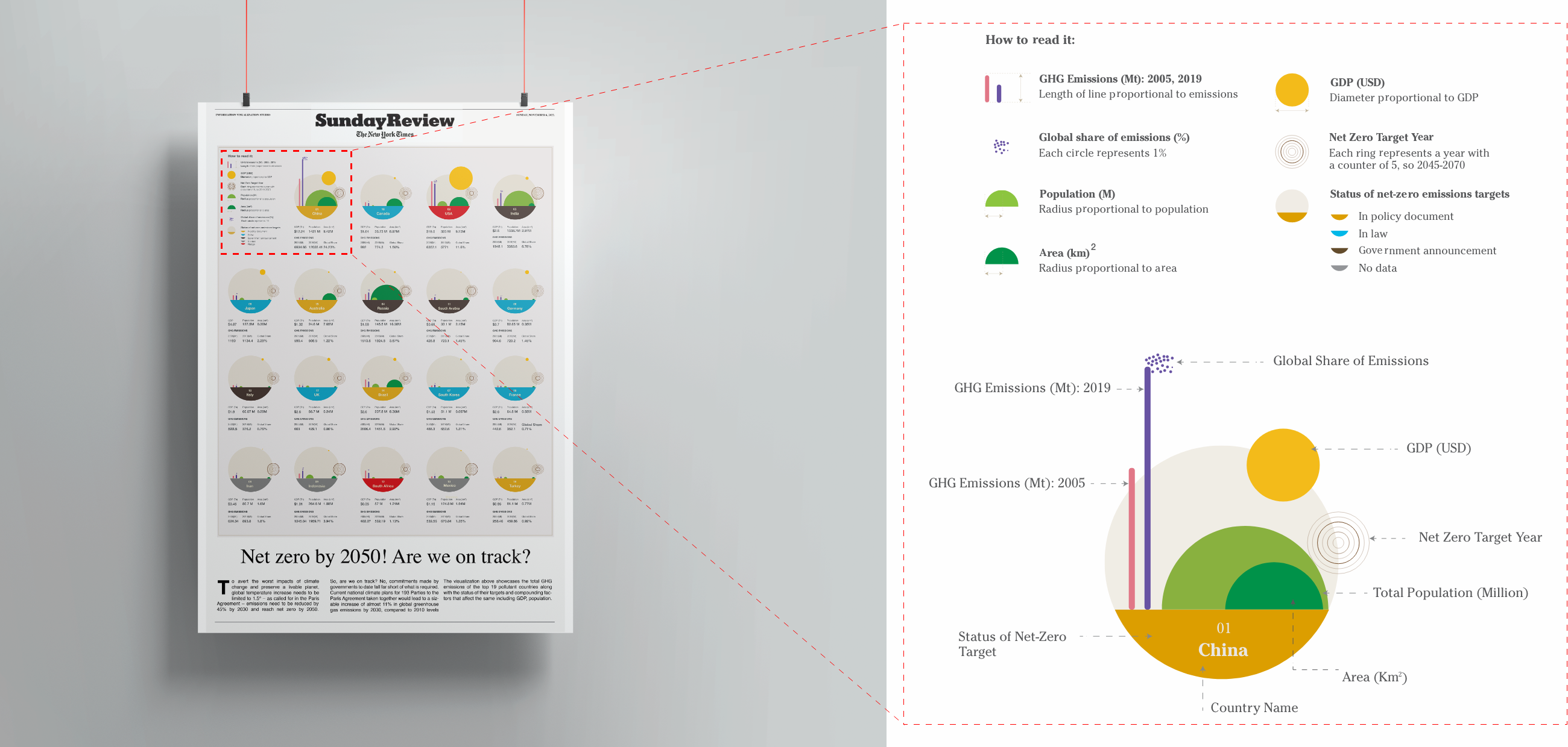
Medium 1 – Newspaper Leaflet
Imagine your morning newspaper giving you a snapshot of how your country in ranking in it’s net zero target.
The visualization represents the data of each country as a visual index. Every element in the visual index denotes a unique data point. For this visualization, I selected the top 19 most polluting countries globally.
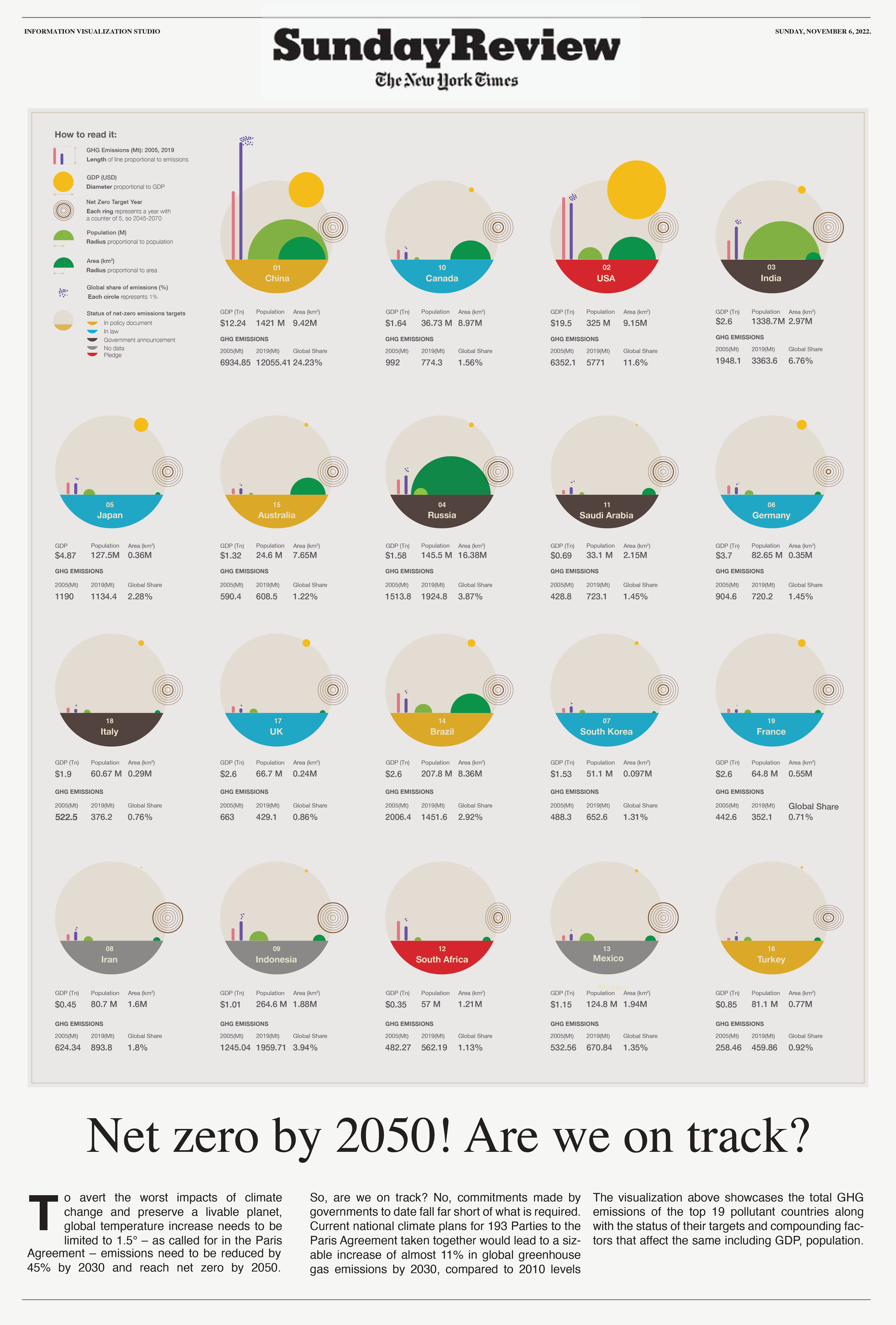
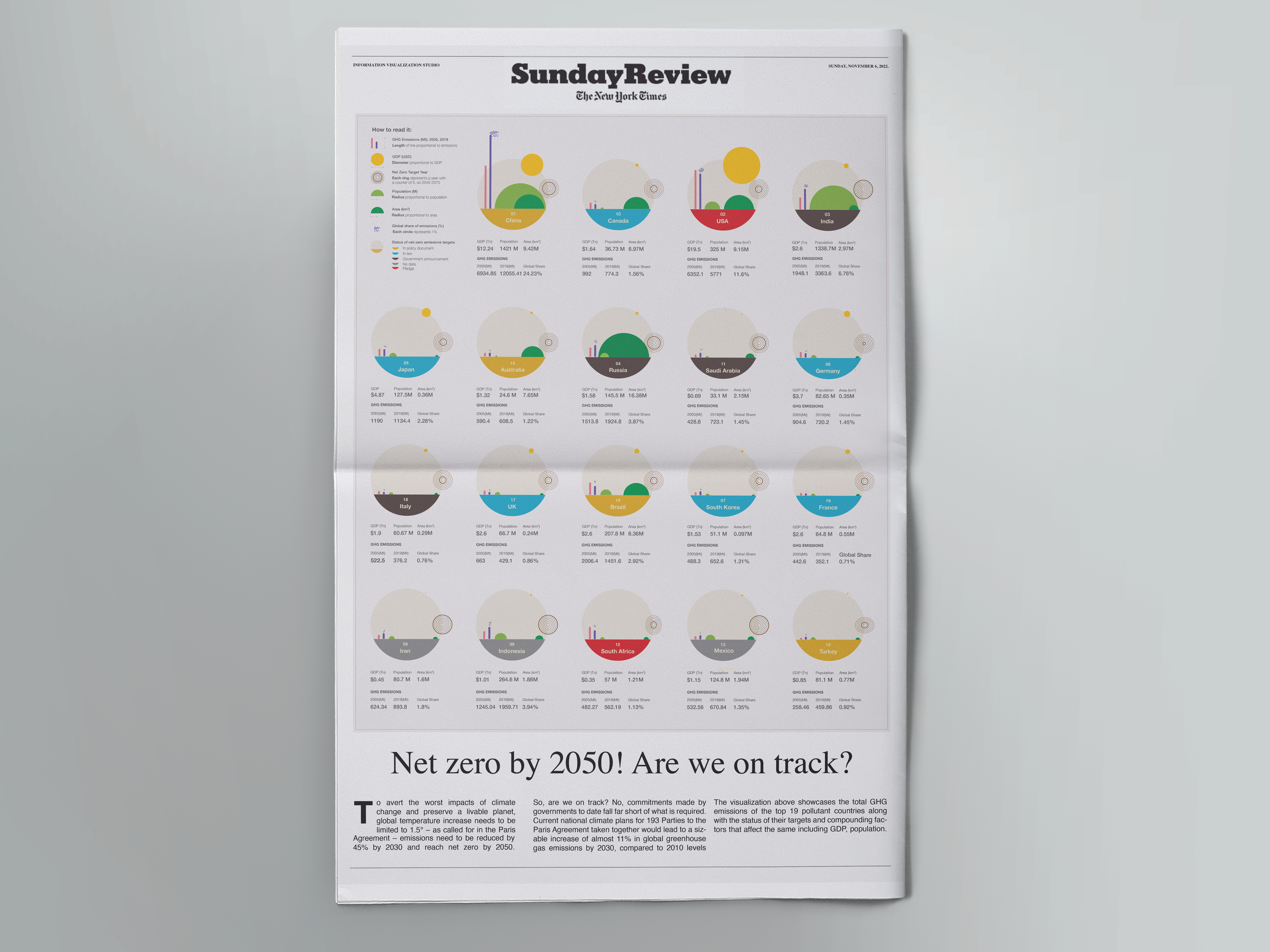
Adapted as a newspaper
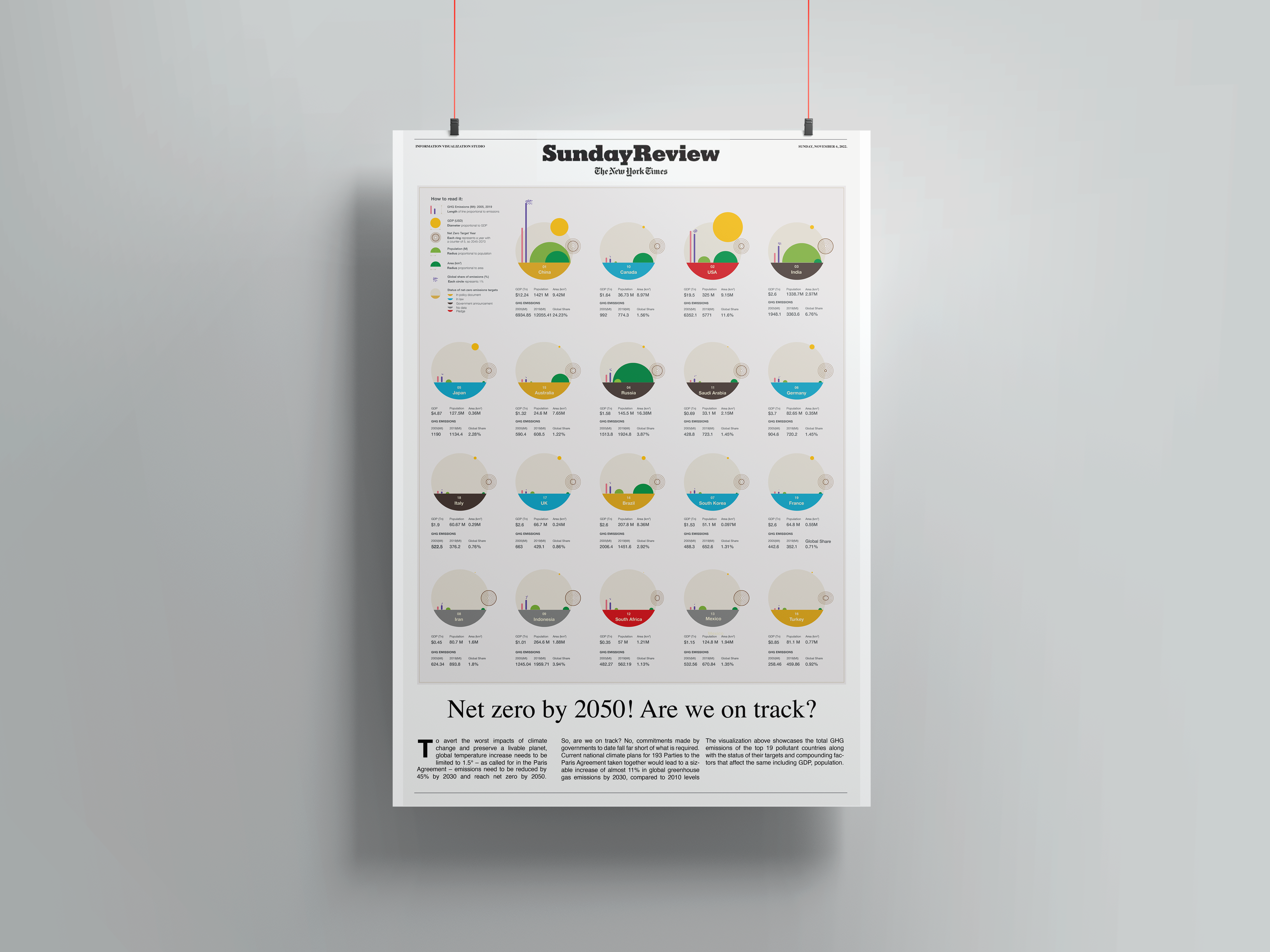
Adapted as a poster
Final Design
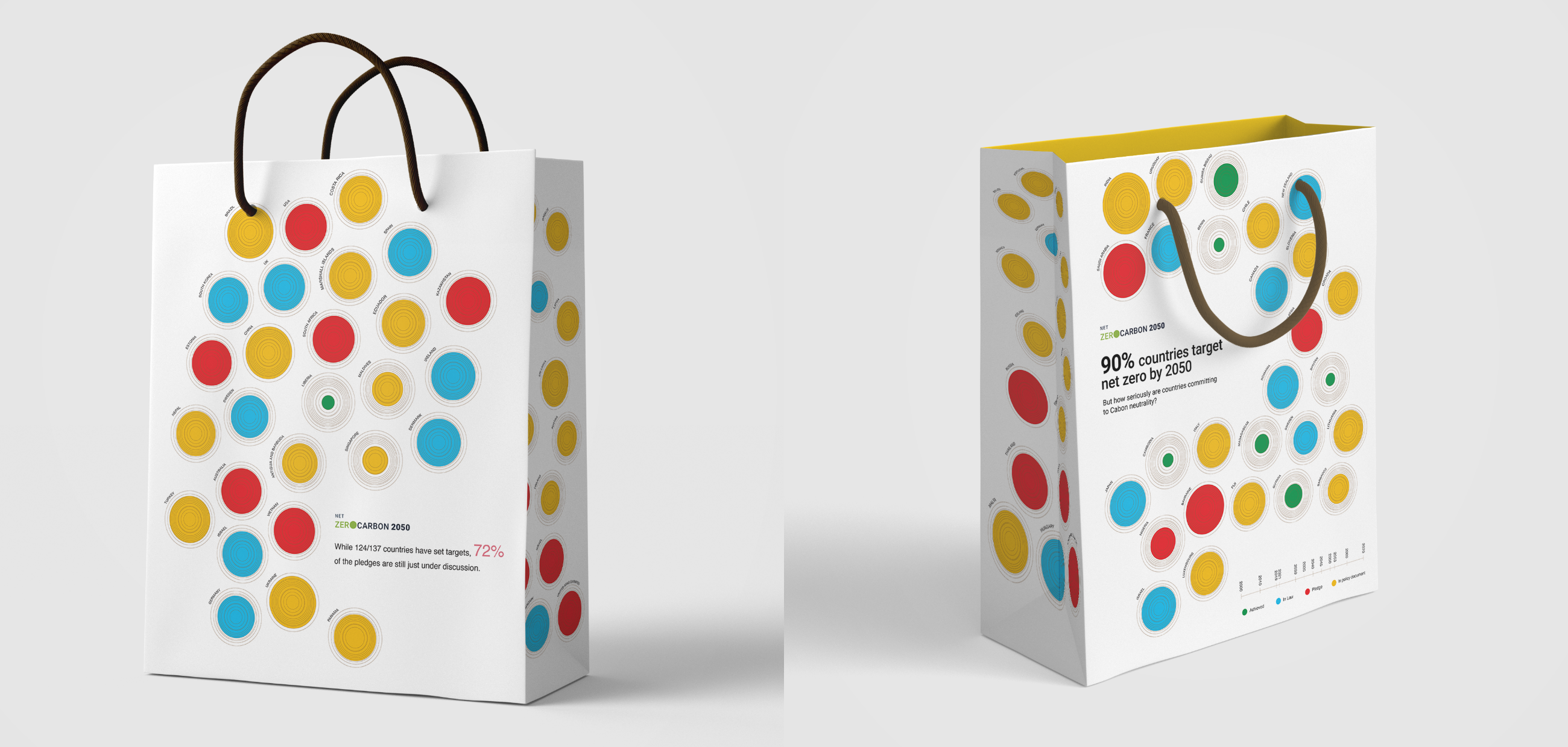
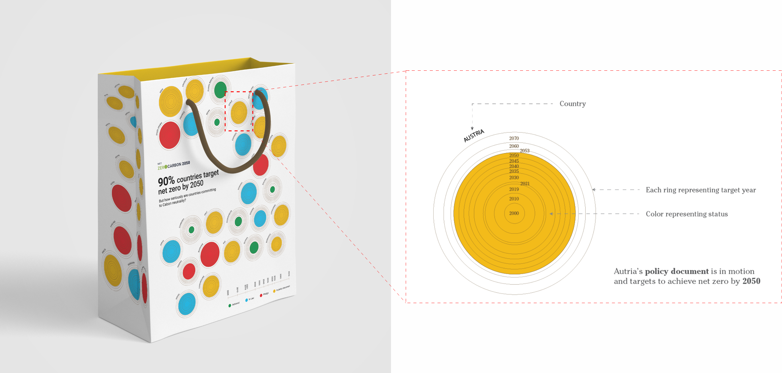
Medium 2 - Wearable (Bag)
I imagined the bag to be a SWAG (something we all get) takeaway touchpoint given to every member at a conference like United Nations.
The bag has been designed using polka dots, where each polka dot represents a country along with it’s target year to achieve net zero and current status of the goal.
Final Design
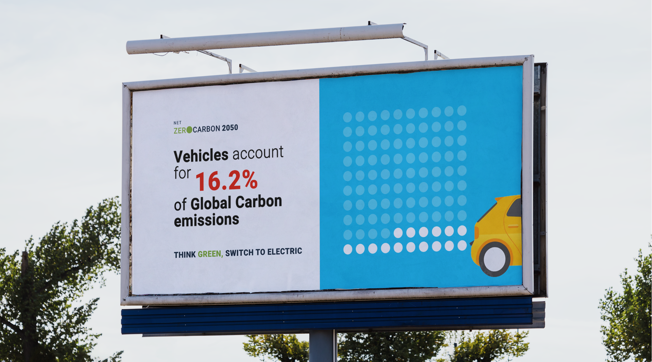
Medium 3 - Outdoor Display (Billboard)
The datasets showed that vehicles are one of the major contributors of green house gases. To showcase this data and spread awareness among commuters, I used a billboard display as the medium.
The visualization for this had to be minimal and easy to register at a single glance as it would be looked at by people on the road.
Final Design
Medium 4 - Digital Media (gif)
For the gif, I played with the colors and circles to depict the increase in carbon emissions from 2010 to 2020. This was followed by an envisioned roadmap of reducing carbon emissions by 45% by 2030 to reach net zero by 2050.
This gif could be incorporated on social media, or the UN website as a representation of the envisioned goal.

Takeaway
Reflections and Key Learnings
This was a super interesting and fun project. I learnt how to read, compile and investigate large datasets to derive insights.
This was my first experience exploring different visualizations and creating detailed glyphs that represent complex data in an easy to digest format. This taught me about visual cognition to create high-level representations.
Via this project, I also got in touch with editors from the NY Times to get their feedback on the type and format. This opportunity helped take the visualization a step ahead