UX Research & Design | Product Interface | Travel
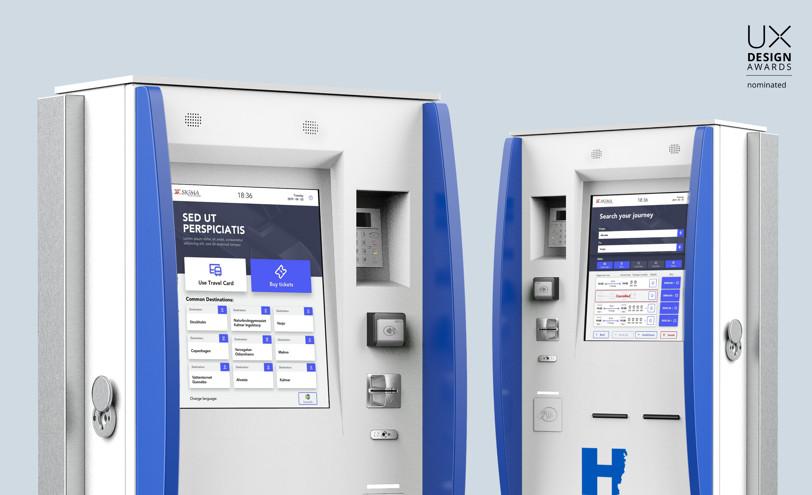
Simplifying interactions with Ticket vending machines
Simplifying journey planning for public transport commuters in Sweden by enabling hassle-free ticket purchase while prioritizing accessibility and adaptability in design.
Overview
Client and Studio:Sigma in collaboration with Studio Volpi
Role: Product Designer
Duration: 12 weeks
Stakeholder Collaboration: 1 Project Manager, 1 Product Owner
Methods and Tools: Contextual inquiry, Semi-structured Interviews, Surveys, Usability Testing, Sketch, Zeplin, Adobe Illustrator, Google forms, MS Excel, draw.io
Deliverables: Field research report, Process flow map, Wireframes, High-Fidelity Mockups, Usability test plan, Interactive Prototype
Highlights and Impact
🚀 Product rolled out in 4 counties in Sweden in Dec 2019, currently used by the public at large
🏆 Project nominated in the Top 50 products category by the UX Design Awards, 2019
📉 40% reduction in time for task completion revealed by pilot tests
📈 Survey data on the new designs yielded a System Usability Score of 88
The Problem
Commuters in Sweden face frustration due to outdated and inconsistent ticketing machines lacking digital payment integration, efficient error handling, and featuring complex, time-consuming navigation. This results in an inefficient and cumbersome ticket purchase or smart card loading process.
Situation and Challenge
Sigma, a producer of self-service ticket vending machines, developed updated machine designs that required a simple and intuitive interface.
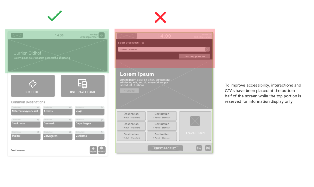
The challenge was to cater to diverse customer groups in the public sector, ensuring an intuitive experience across multiple travel types and accessibility for both wheelchair and standing users. Additionally, understanding constraints in touch interactions and design components posed a challenge due to the non-traditional interface.
Approach
Outlining research goals
I began by identifying research goals to challenge assumptions, redefine problems, and uncover insights for the public-facing ticket vending machine. The outlined goals were
🎯 Identify user travel habits, needs and preferences
🎯 Identify users interaction with existing machines
🎯 Understand what works well and what could be improved
🎯 Evaluate accessibility for wheelchair users and users with low vision
🎯 Evaluate usability of current system
Approach
Methods used to achieve these research goals
All research methods outlined below were conducted over a span of 3 days alongside a Swedish speaking stakeholder from the Regional Transportation Authority.
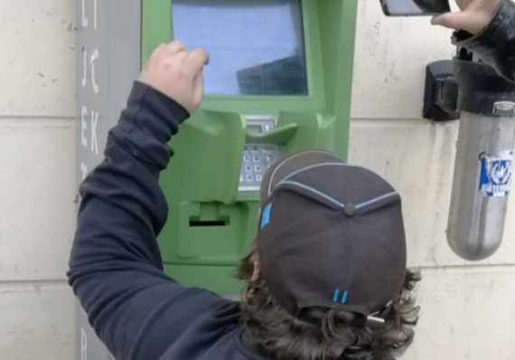
Contextual Inquiry – Observe
With 37 users across 2 stations in Sweden: Växjö and Kalmar
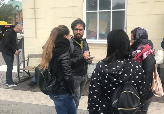
Semi-structured interviews – Listen
7 planned and 54 guerrilla interviews
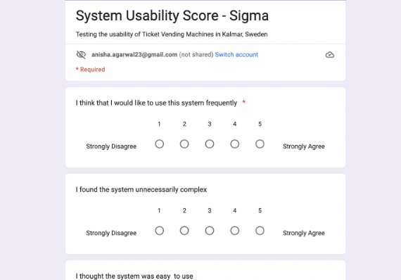
On field survey – Gather
Taken by 34 users using Google Forms
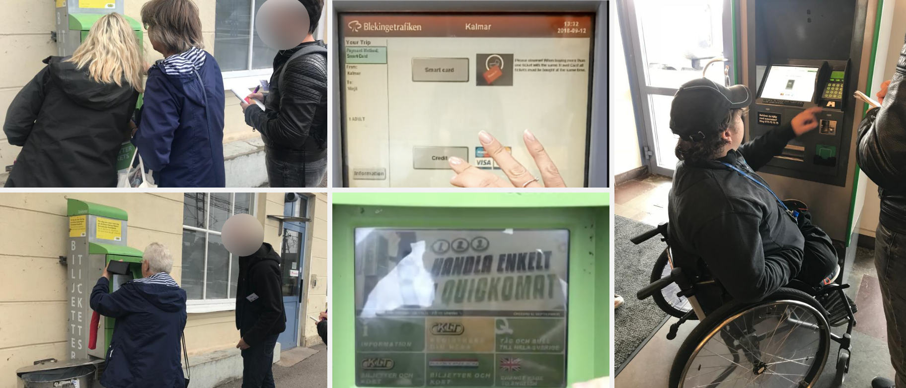
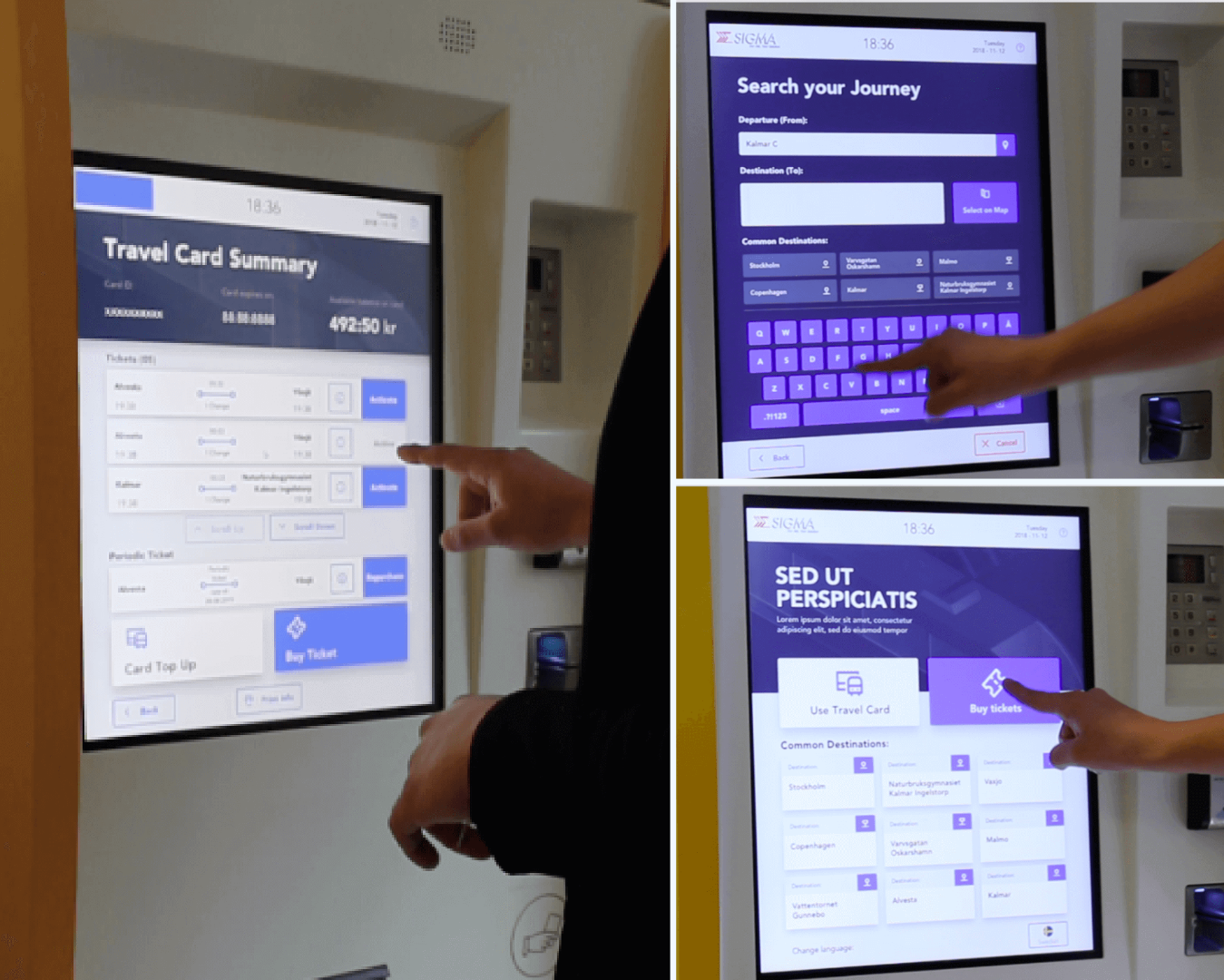
Snapshots from on field research
Discovery
Observations from field research
Macro-level overview of exploratory research findings
Discovery
Preliminary research confirmed assumptions and identified six core user groups
This informed the creation of target personas based on field interactions to address user needs and frustrations.
The Tourist
A keen traveller who likes exploring a new city like a local
The Elderly
Retired worker with a travel card to use from time to time
Daily Commuter
Everyday commuter with monthly seasonal tickets
The Student
Frequent traveller with a student card
Wheelchair user
Commuter with a temporary fracture affecting mobility
Service technician
Ensures machine functionality and maintenance
Customer journeys, based on field observations, were created to understand persona mental models and friction points, thereby defining core use cases.
Meet Olivia, the daily commuter.
Olivia is going to a meeting at a different location than her usual office, so she needs to take a different train. At the station, she uses the machine to buy a new ticket for the journey.
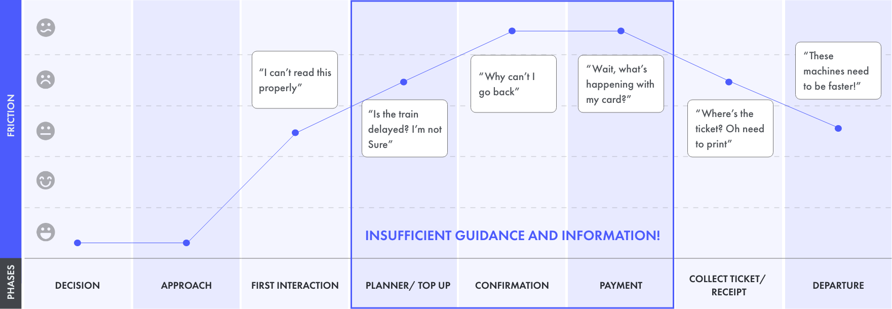
Customer journey map of the daily commuter outlining core friction points
Define
Exploratory research identified six core themes of user pain points.
The core findings were grouped into the following themes after ideation sessions with the team.

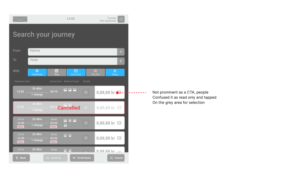
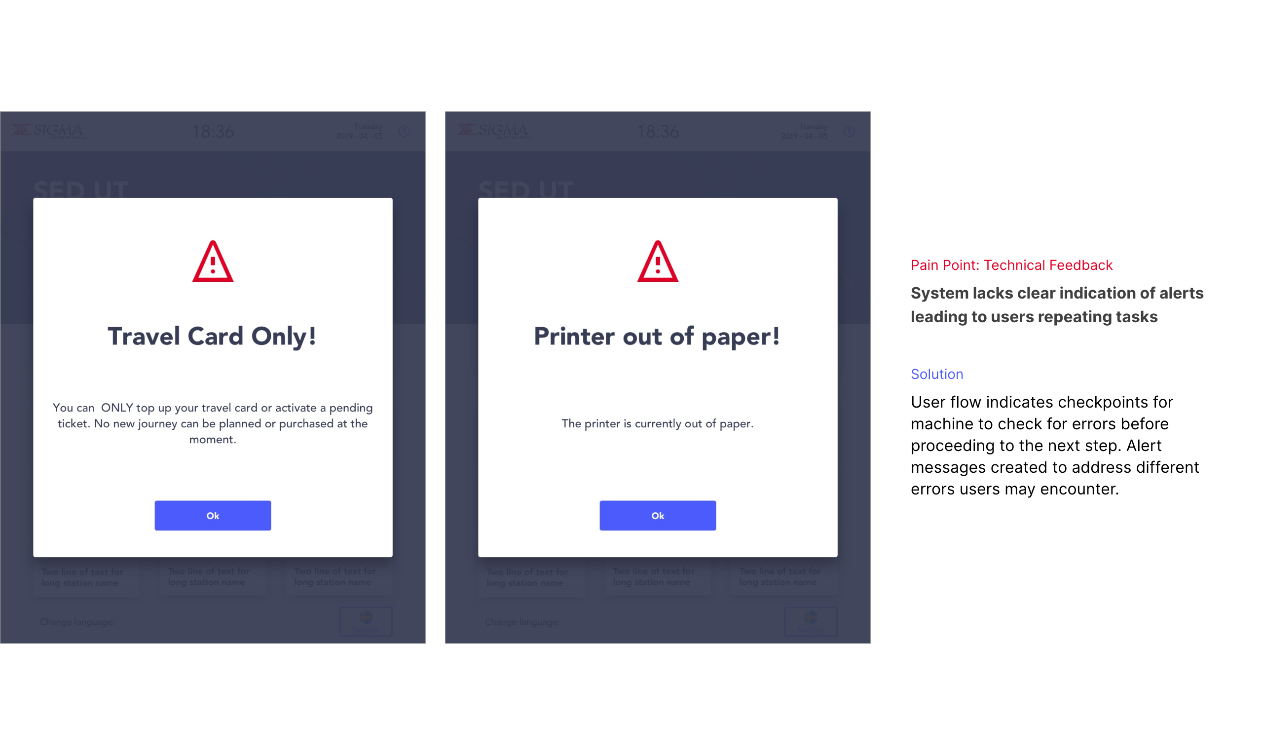
Technical Feedback
No clear indication of alerts leading to users repeating tasks

Features
Confusing nomenclature causing ambiguity in selections and progress

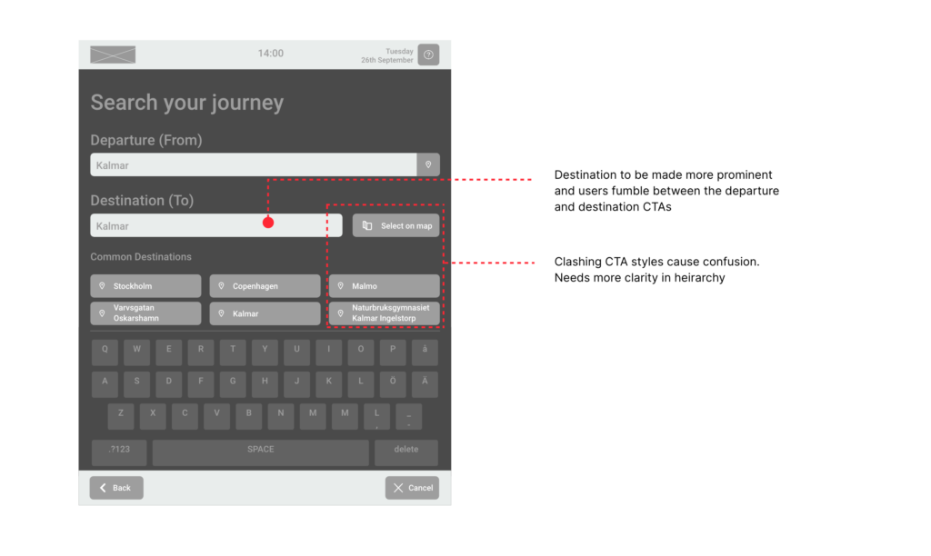
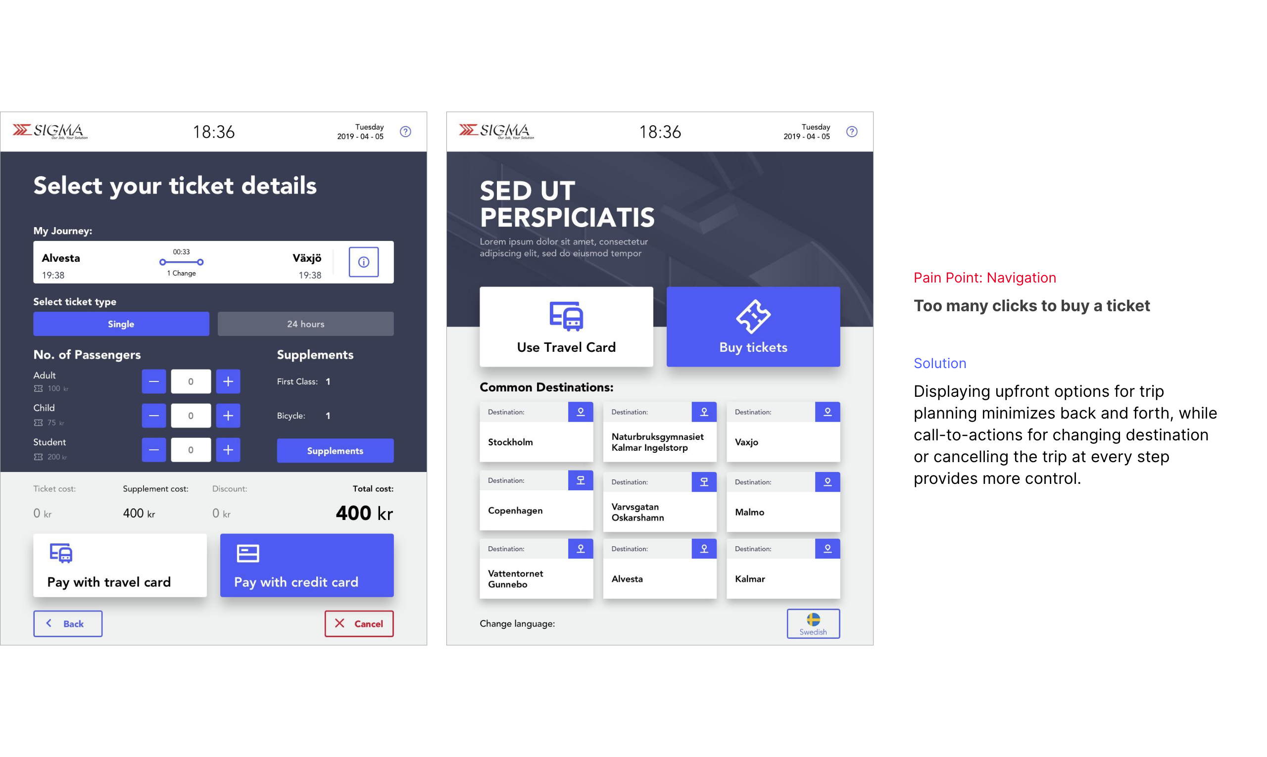
Navigation and flow
Too many clicks to buy a ticket especially for non-travel card related tasks

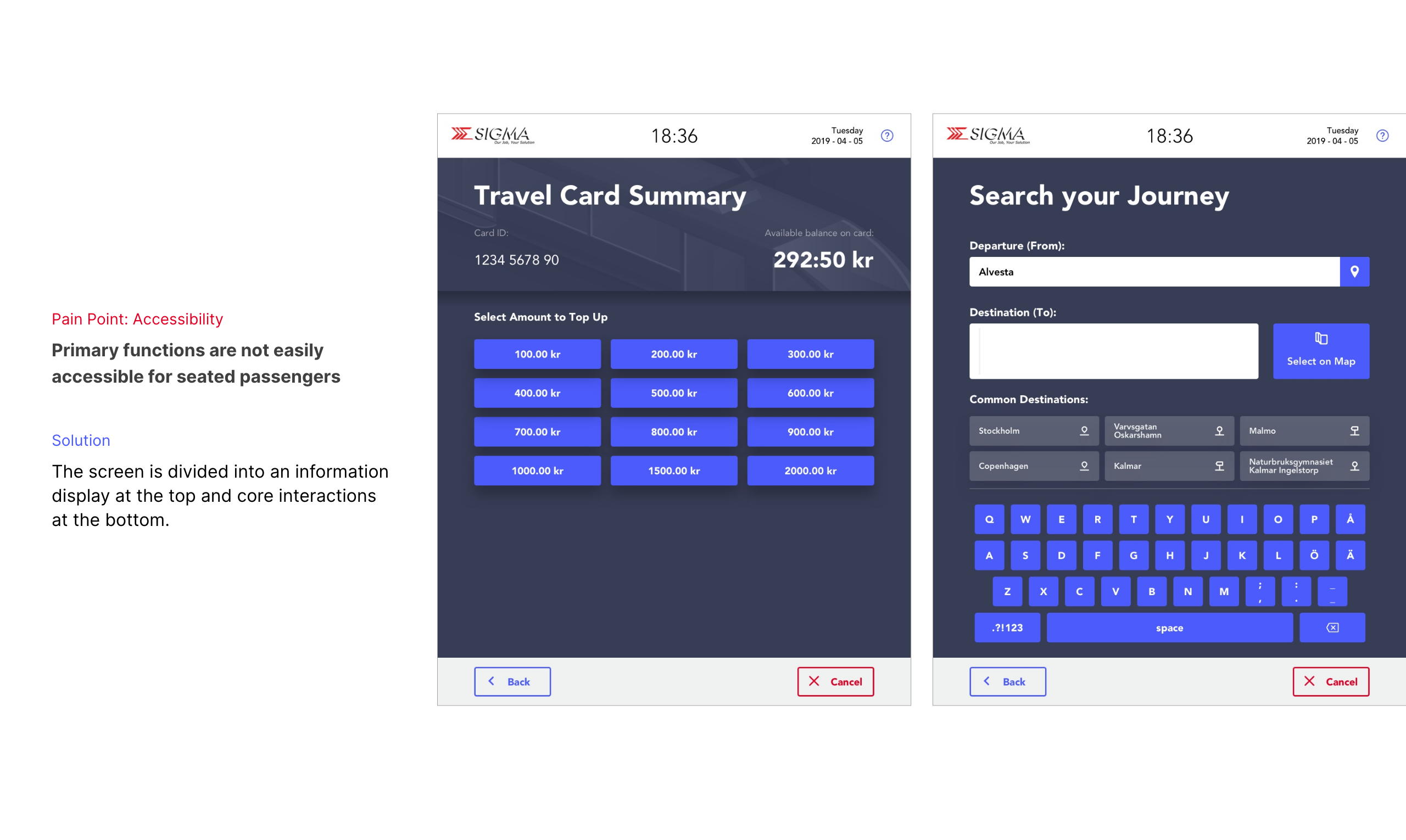
Accessibility
Poor contrast makes for users low vision; primary functions not easily accessible for seated passengers

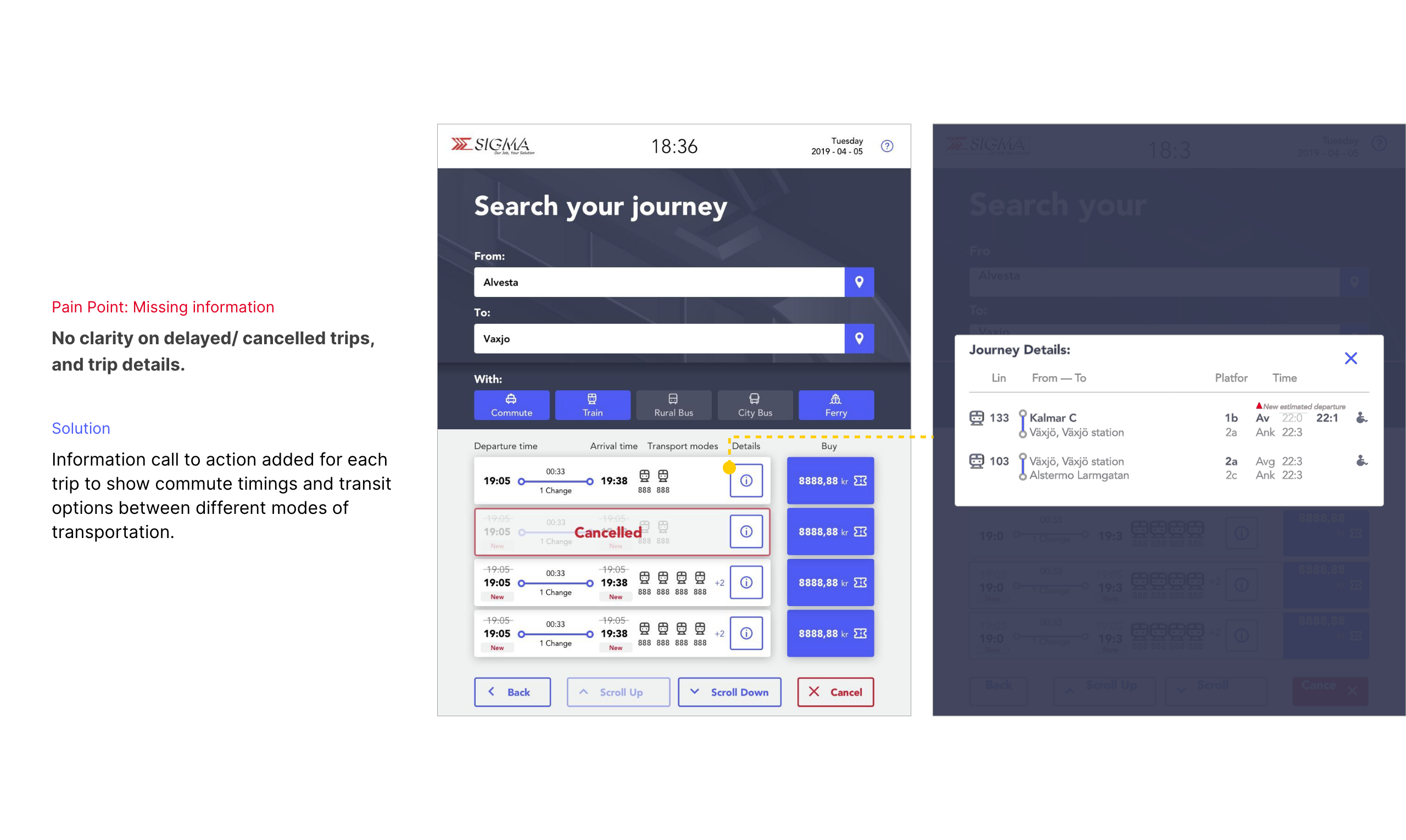
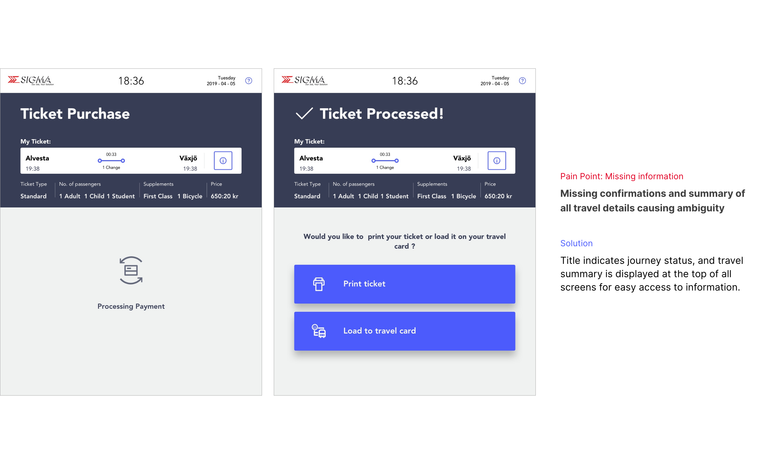
Missing information
Confusion during ticket selection and payment due to missing details and confirmations

Logistics
Machines placed outdoor without a canopy making access tough on rain/snow
💡 Aha! Challenging assumptions
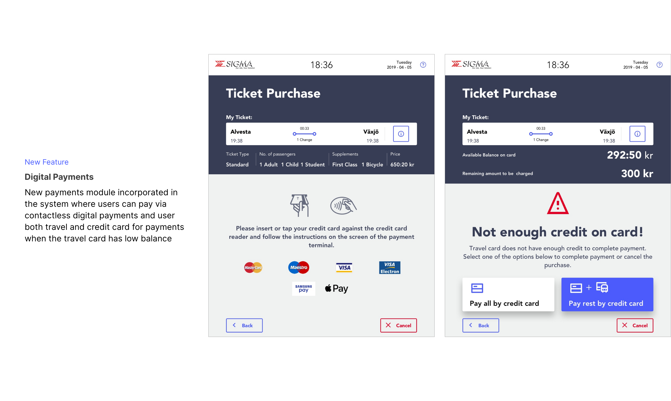
Initial client brief prioritized interface actions for travel card users (purchase, top-up, renewal, print pass), but generative research found 30% of users lacked cards and faced maximum friction.
This data was presented to the client who agreed on redefining the problem statement to focus primary actions on not just travel card but also non-travel card users.
Ideate
Organizing features for an efficient task flow for users
I crafted the detailed user flow through multiple iterations, encompassing all interactions and error troubleshooting checkpoints.
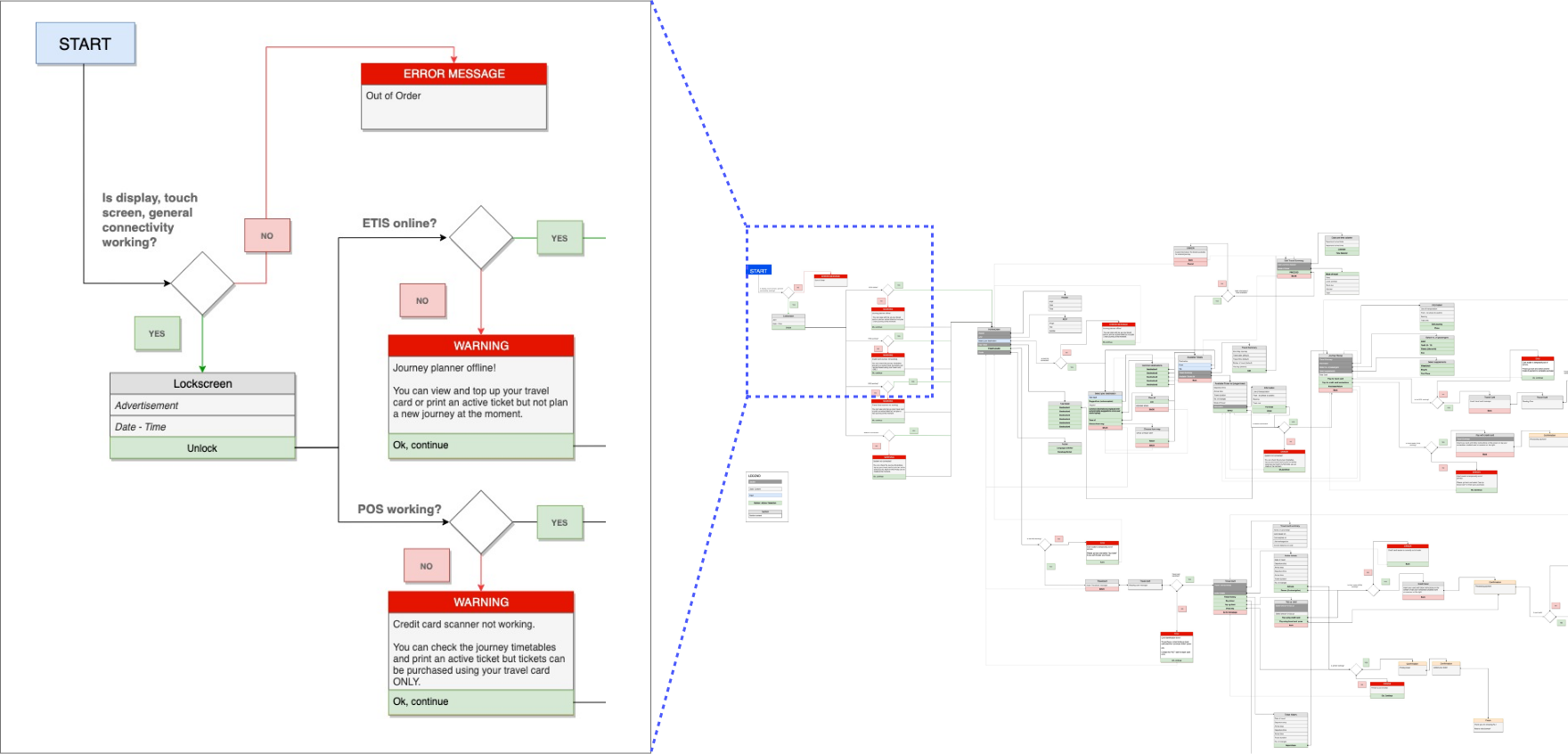
User Flow map made on draw.io
Ideate
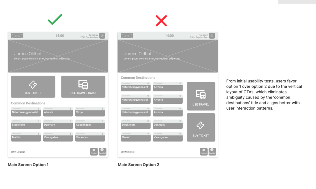
Quick iterations on the structure
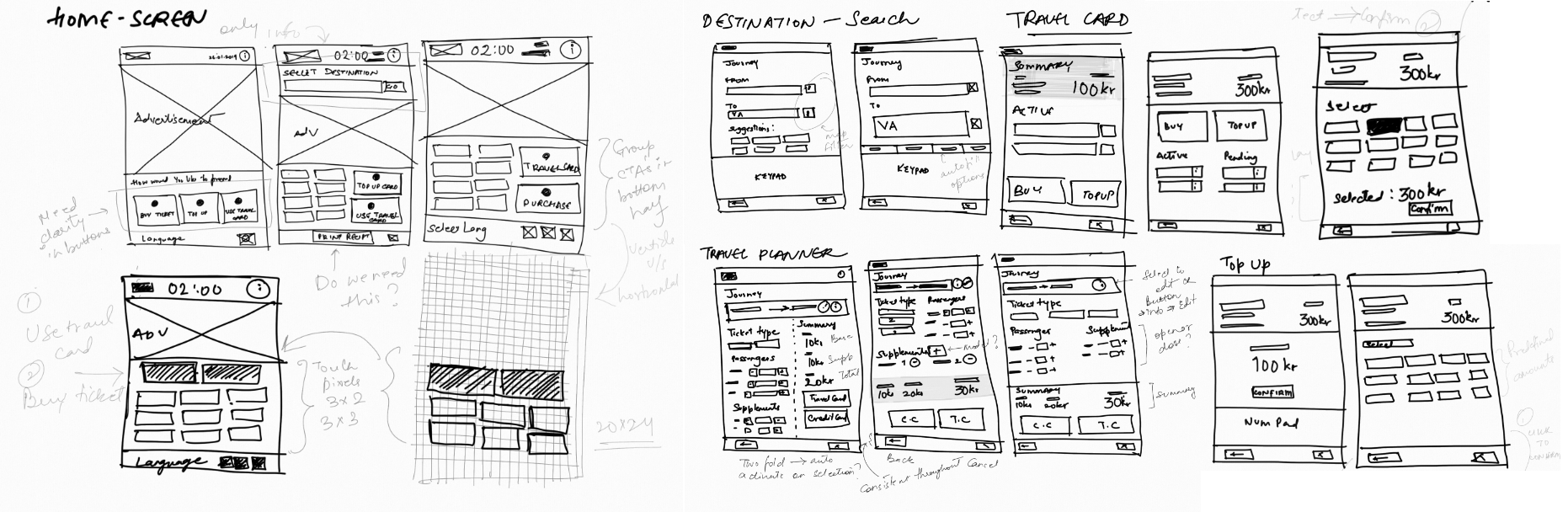
Now, it’s time to dive in. I sketched quick concepts for the main screens, including the home screen and travel planner, aiming for clear, guided flow and avoiding cognitive overload.

Prototype
Building High—fidelity prototypes of the Minimal Viable Product
The wireframes gave further clarity on how users comprehend and interact with the journey planner. This further defined the structure of the screens which formed the basis of the high fidelity prototype
Test
But, does it work? Usability Testing
To test the efficiency and usability of the design, usability tests were done using a simulation of the interface. Users for the tests were members from the studio, and client team who had not seen the design when in progress. 6 task flows were identified for the unmoderated remote test that cover the core use cases.
Deliver
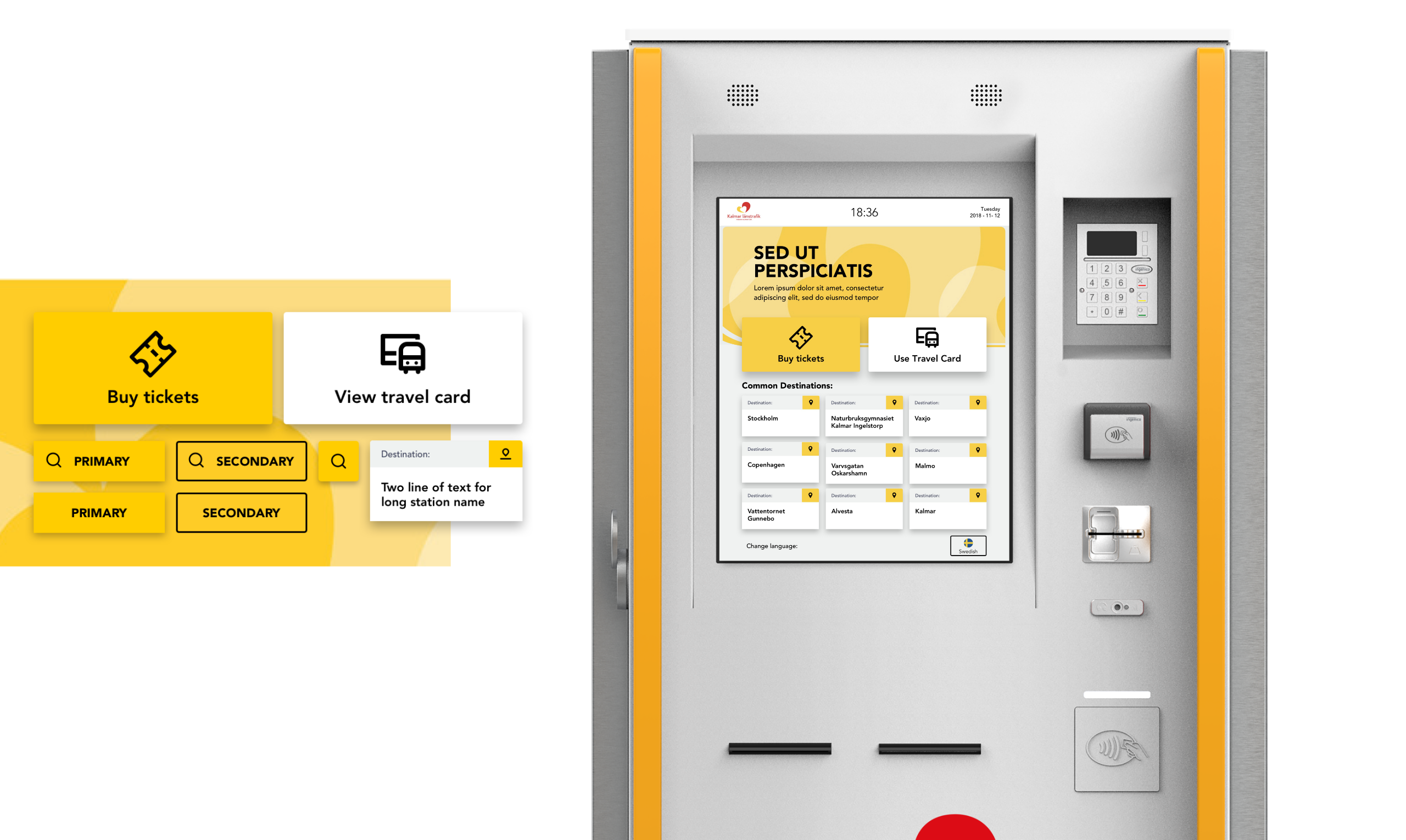
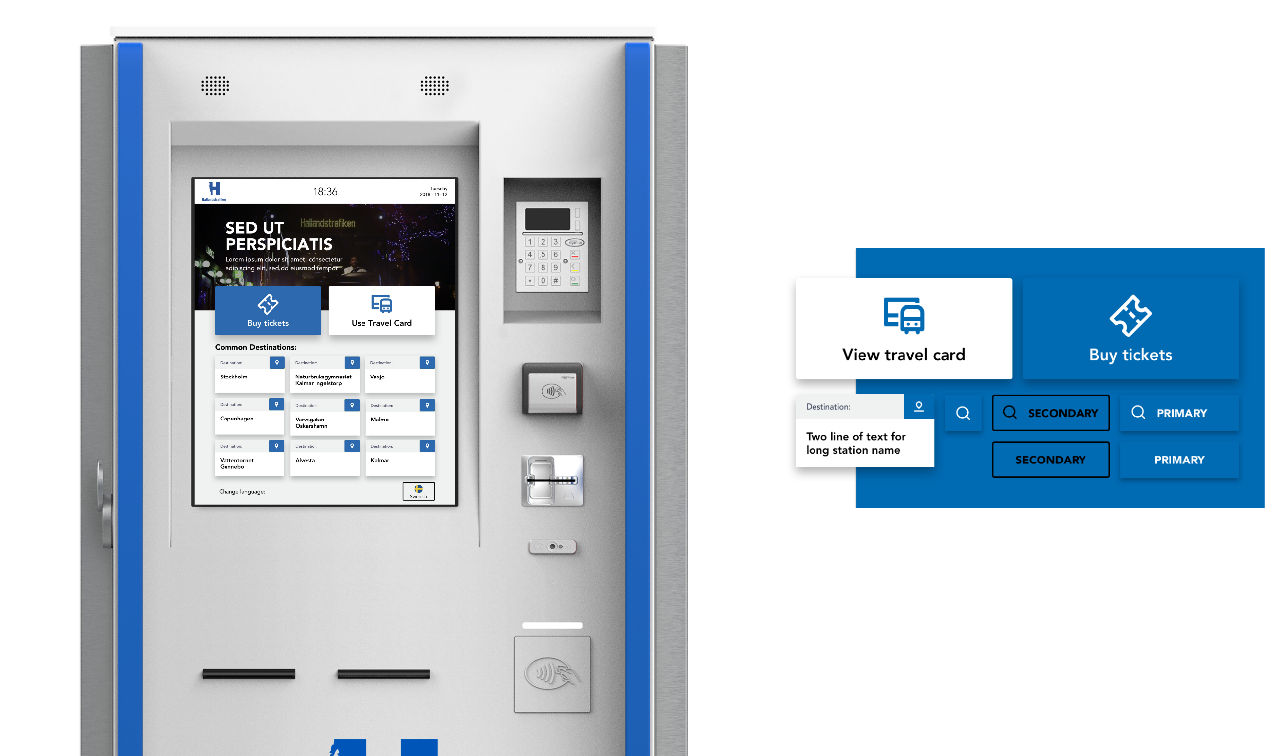
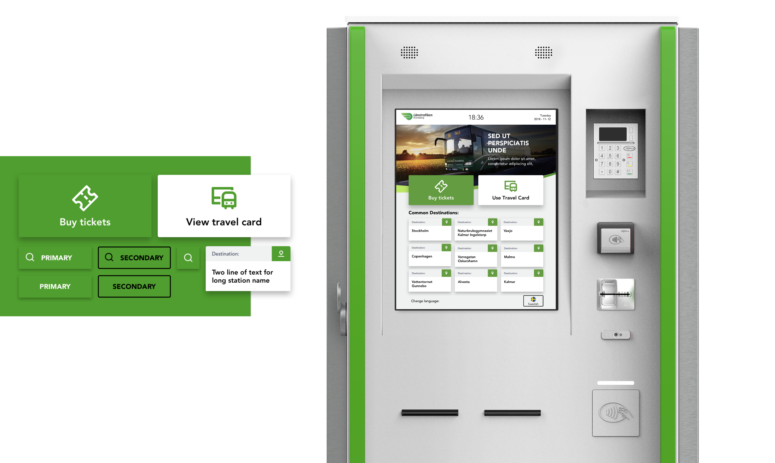
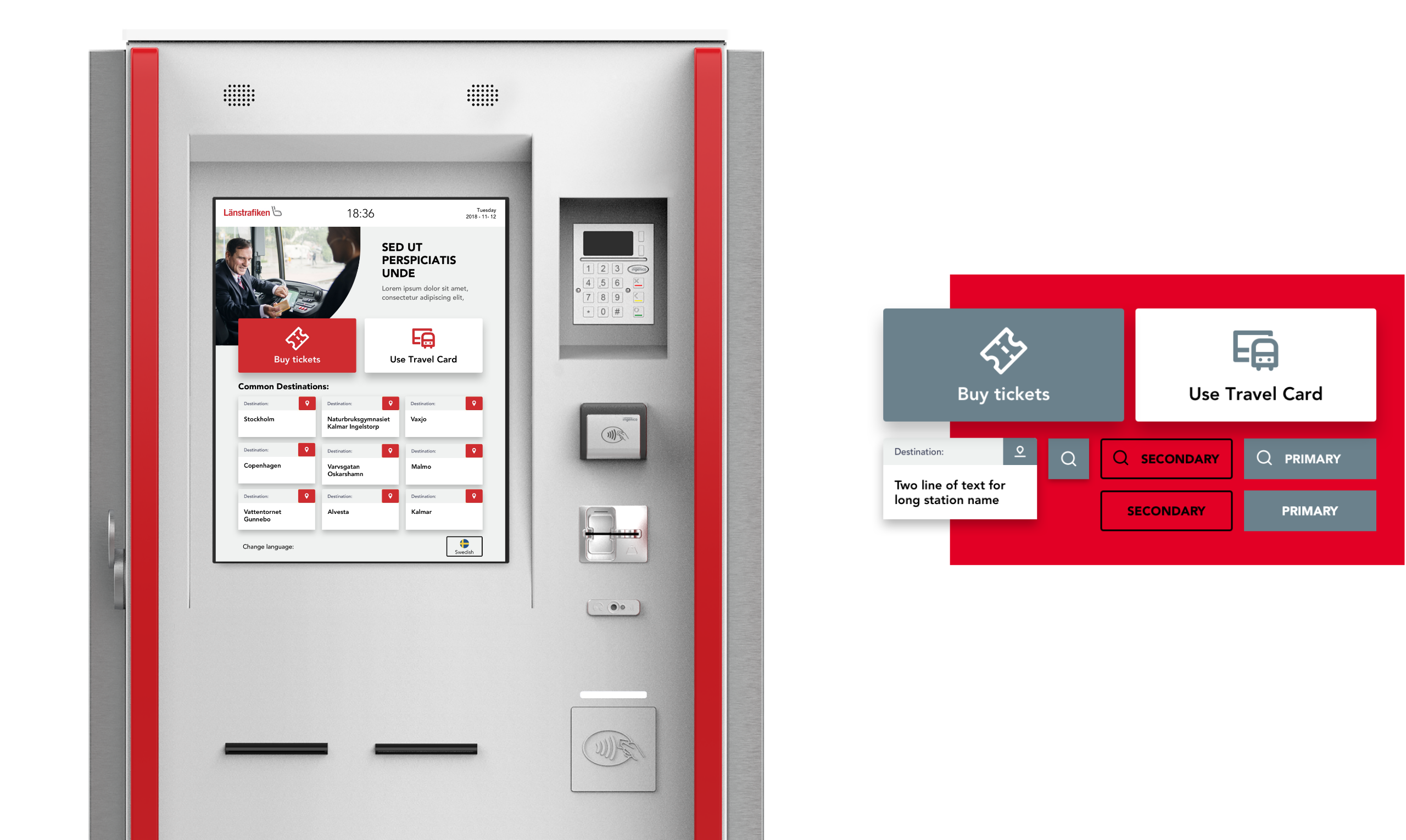
Adapting the visual language to the 4 brands
The interface would be implemented on the 4 brands of machines based on the counties in Sweden. For this, I adapted the screen to 4 visual styles subject to the colors of the 4 brands. The core idea here was to adapt the screens with minimal impact on the design elements for feasibility in the build.
Result
Impact
Final product launched in Dec 2019 after pilot tests revealed 40% reduction in time for task completion.
Survey data on the new designs yielded a System Usability Score of 88, a 36% increase from the old designs
The Project was nominated in the Top 50 products category by the UX Design Awards, 2019
Takeaway
Reflections and Key Learnings
Designing for multiple user groups – There is no one size fits all
Conducting contextual inquiries and guerrilla interviews with users on field
Adapt quickly and always understand why something works/ doesn’t work: Product hardware, designed for durability, featured thick touchscreen glass and outdated speed, constraining interactions. Limited resources prevented second on-site usability tests, leading to testing within my network.